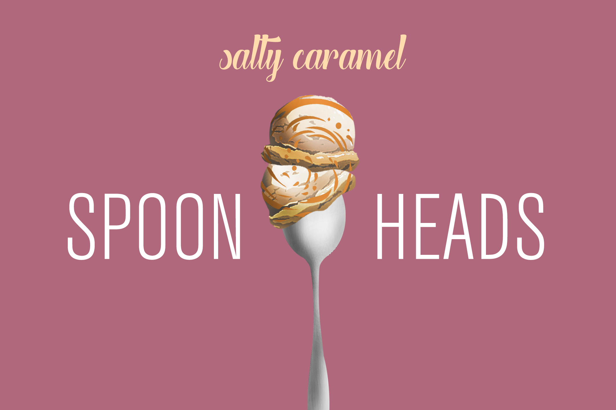
SPOONHEADS
Branding Concept
RETURN
PROCESS
Inspired by my sweet tooth and round head that resembles a spoon, I created Spoonheads to show how they may work together, on its own, and appeal against standard ice cream packaging. The final product included a branding guide outlining Spoonheads complete color palette, typography standards, iconography, and main and secondary logos. Additional assets included a website, business card, and location mockup for the brand.
Tools Used: Illustrator and Photoshop
LOGO
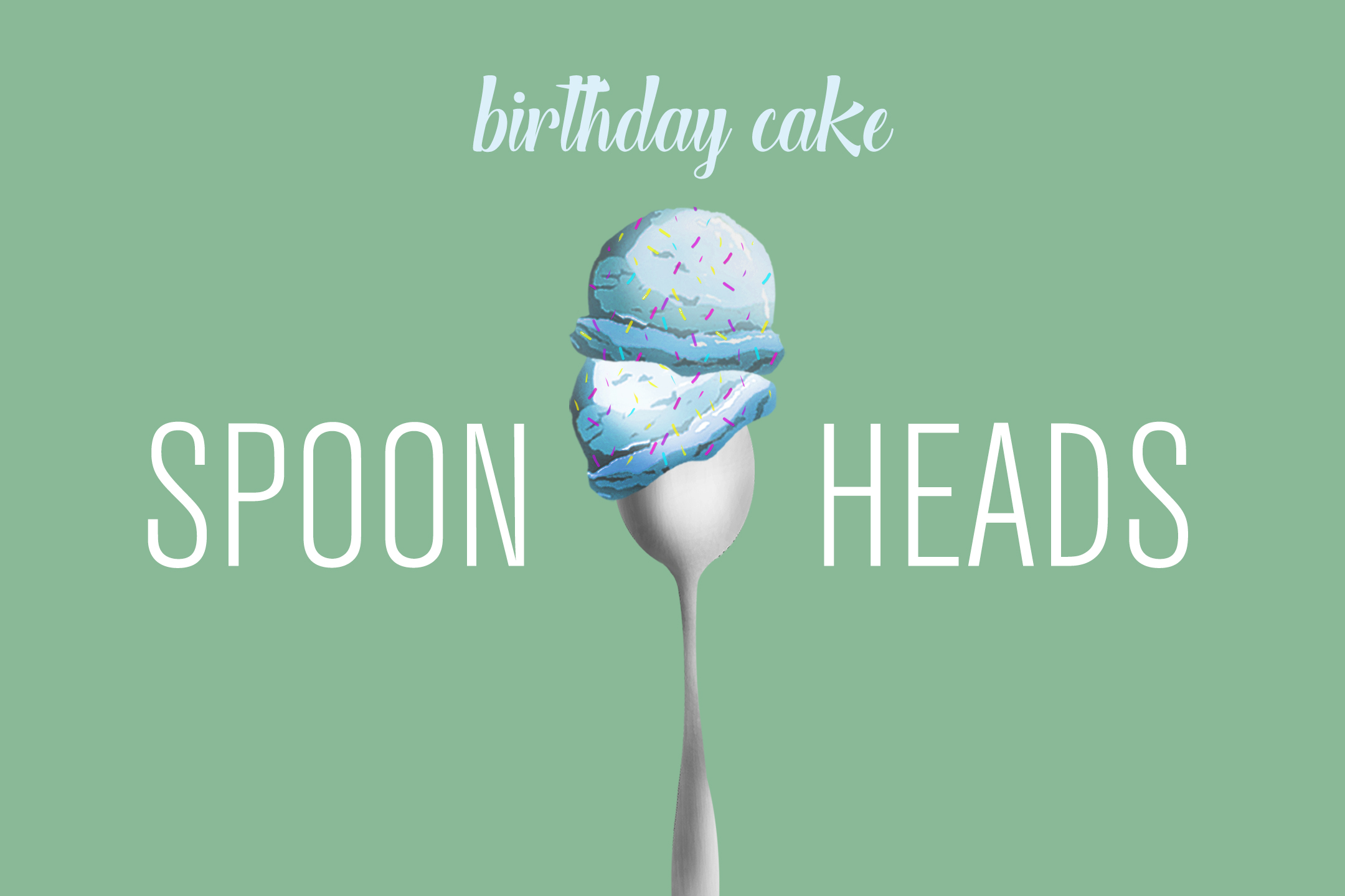
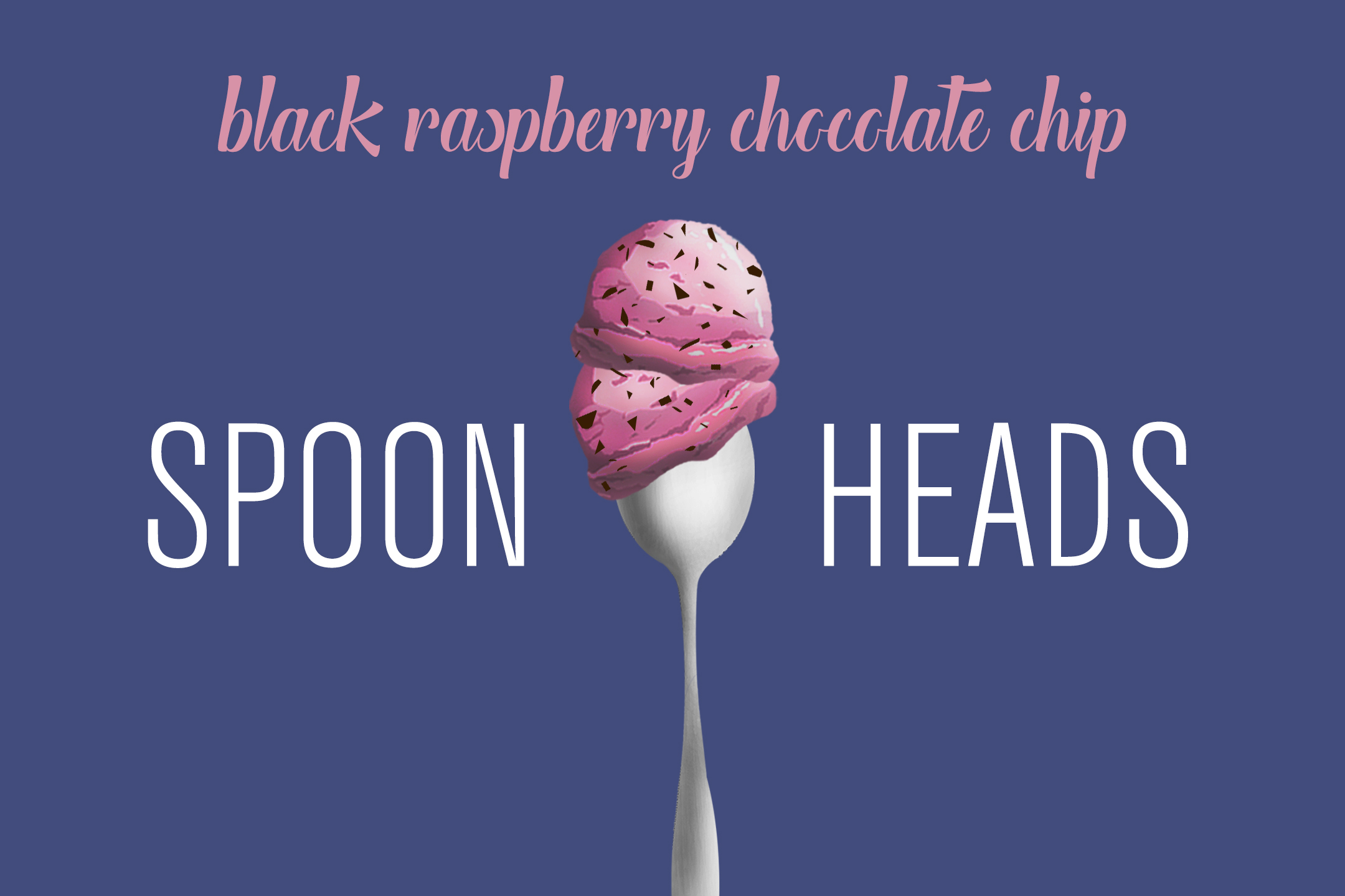
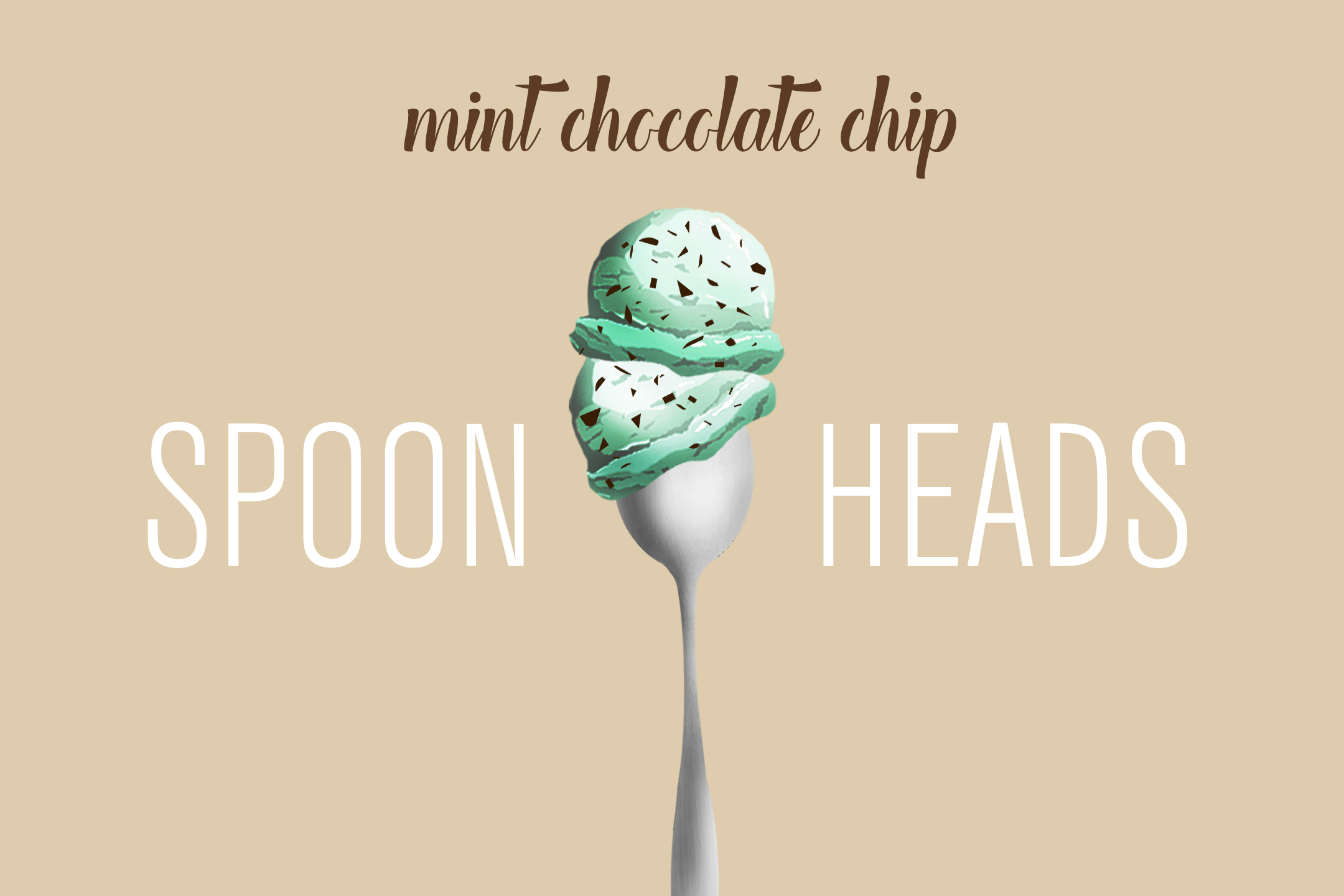
SUPPLEMENTARY LOGO

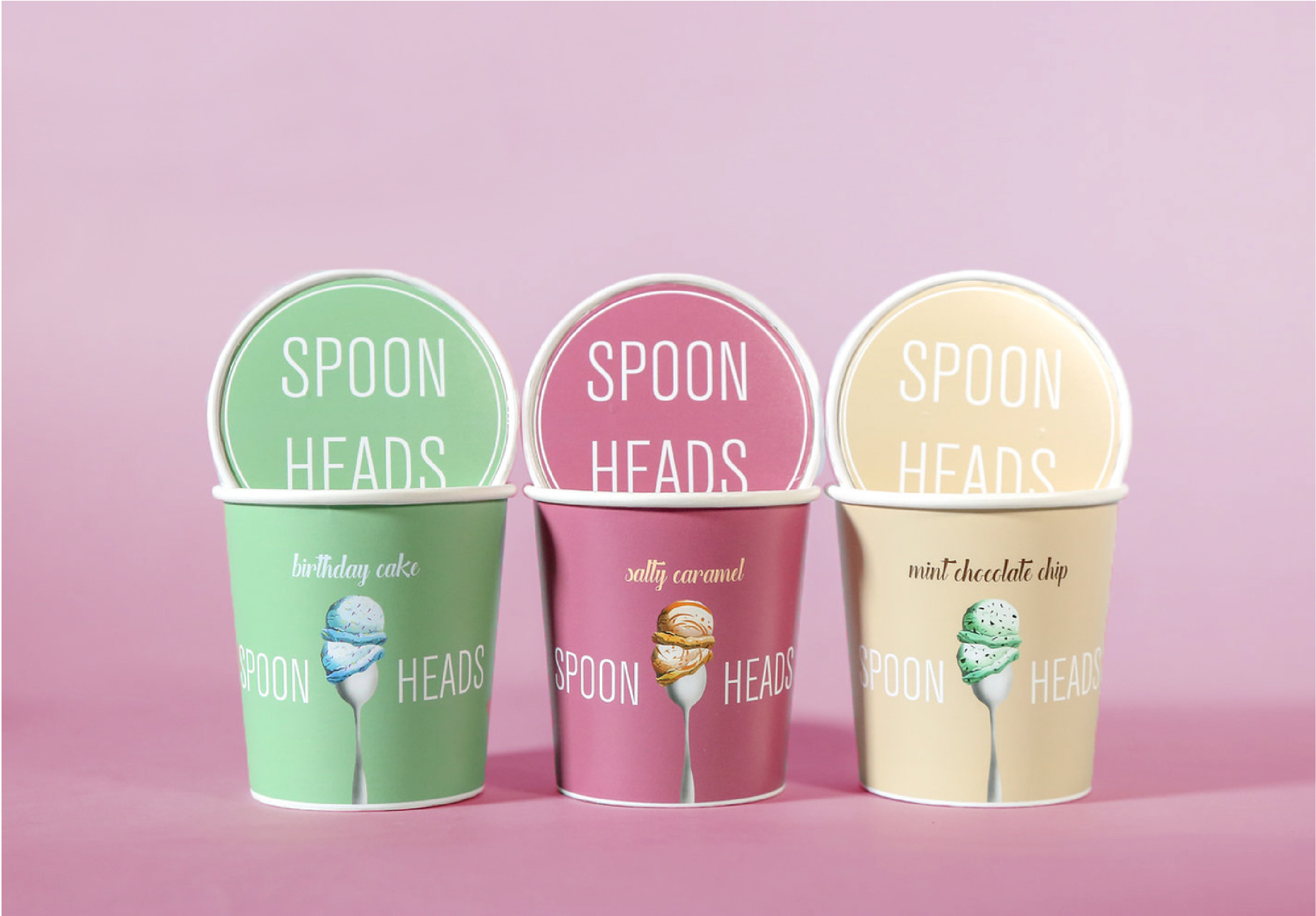
ICECREAM LABELS
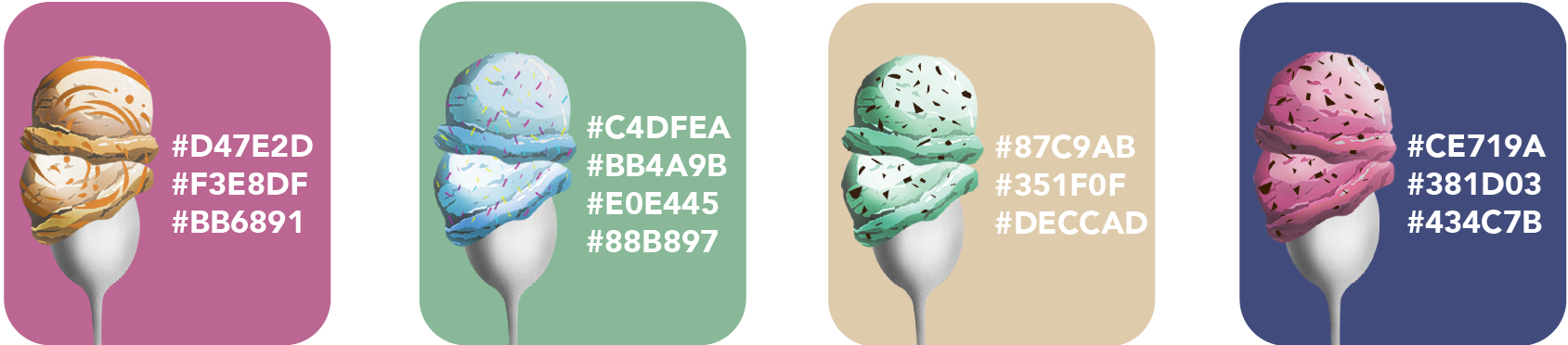
COLORS

PACKAGING COLORS
FONTS

WEBSITE WIREFRAME